Wasteful Widgets #4: Maps
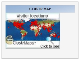
Like many bloggers, I have a map on site showing where visitors are coming from. Why?
 World viewI think there are two aspects to this question: why have a map, and why show it to the world?
On the first issue, it is quite nice to look at one's reach. I have to admit to a little thrill when I see that someone in Borneo, say, has been checking out my blog. And I find it fascinating that I can write something now, sitting here in my home near London, England, and seconds later someone on the other side of the world, in Australia or New Zealand, can be reading it. I am still intrigued despite having done this kind of stuff for nearly 15 years.
But the other question, about why show it, is more problematic. At first, I did so because I wanted people to see that I am being read internationally. I now feel that one should be able to take it as read that that's the case, and not make a big deal out of it.
I also think, like recent comments, it's a matter of context. When I took part in the Classroom 2.0 Live discussion, people were asked right at the start to click on a map to show where they were listening from. Seeing the whole world 'light up' as members of the audience did so was an incredible experience. And for me, as the guest speaker, it really did bring it home to me that, although I was loafing around in casual clothes and unshaven, I was addressing a global audience in just as real a way as if I had been speaking at a physical event.
So, given that there's not much point in displaying a map on my site, because it lacks context and smacks ever-so-slightly of egotism, why do I continue to do so?
The answer, I'm afraid, will be familiar to married men everywhere. My wife likes to look at it, and doesn't want to have to bother logging in in order to do so.
International ICT in education superstar I may be, but at home I know my place!
Other articles in the Wasteful Widgets mini-series
Wasteful Widgets #1: Most popular articles
Wasteful Widgets #2: Twitter Feeds, and 7 Reasons to Eschew Them